When readers pick up your book, they notice more than just the words — they feel them. Typography is the hidden storyteller that shapes a reader’s mood before they even read the first sentence. The right font choice can make your book feel elegant, exciting, mysterious, or playful. In this guide, we’ll reveal how fonts influence emotions and how you can use them to strengthen your message.
Fonts are not just shapes — they’re visual cues that signal tone and personality. Just as colours evoke feelings, typography can:
Build trust with clean and professional lettering.
Spark curiosity with artistic or unique letterforms.
Create urgency with bold and high-impact typefaces.
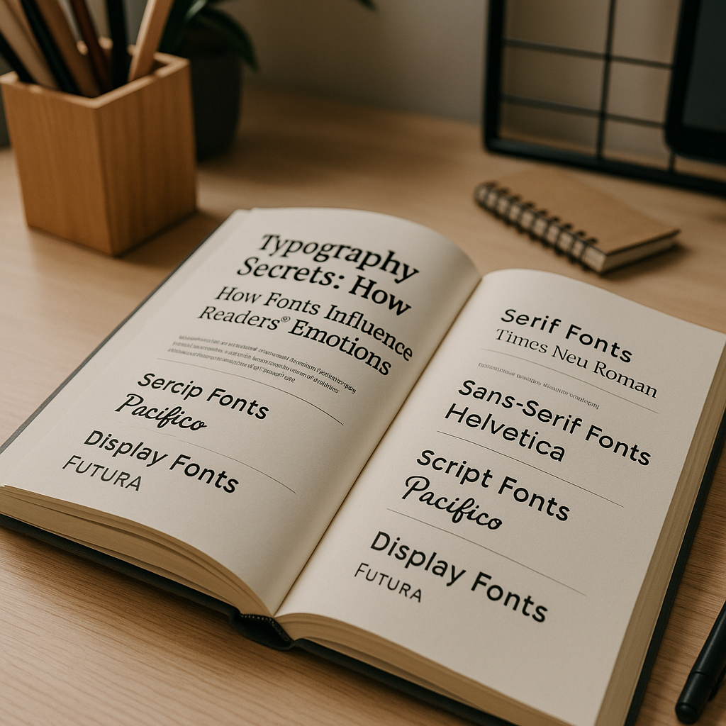
Examples: Times New Roman, Garamond, Baskerville
Evoke trust, history, and reliability.
Commonly used in literary works, newspapers, and academic books.
Perfect for non-fiction or classic-themed fiction.
Examples: Helvetica, Arial, Open Sans
Minimal, sleek, and approachable.
Works well for contemporary fiction, business books, and design-forward brands.
Popular in digital publishing for easy screen readability.
Examples: Pacifico, Allura, Great Vibes
Stylish and decorative, often used for headings or special sections.
Adds a personal touch — ideal for romance, poetry, or lifestyle books.
Best used sparingly for impact.
Examples: Bebas Neue, Impact, Lobster
Designed to make a statement in titles or marketing materials.
Perfect for genre fiction like thrillers or fantasy covers.
Should be balanced with simpler fonts for readability.
Pairing fonts can create a visual hierarchy that guides the reader’s eye:
Serif + Sans-Serif → Professional yet modern.
Sans-Serif + Script → Clean with a touch of personality.
Display + Sans-Serif → Bold headline with easy-to-read body text.
Your cover is your silent salesperson. A mismatched font can confuse your audience or lower perceived quality.
Match your typography to your genre and audience expectations.
Keep legibility a top priority.
Test multiple font styles before finalising.
Typography is more than design — it’s psychology in print. The right font combination can instantly connect with your audience, enhance your storytelling, and leave a lasting impression. In publishing, it’s not just what you say; it’s how you show it.